OVERVIEW
FINDING THE PERFECT BANNER
Problem statement. Find incremental revenue on the Yahoo Finance desktop website. Can we design a search ad format that monetizes better than the most prominent display ad on Yahoo Finance?
Hypothesis. Users of Yahoo Finance tend to be task and research-oriented, similar to how they might operate when using a search engine. As the user is already captive, they may already be primed for search-based advertising. We would like to see if users are more likely to click search-based ads than targeted display ads. Are there specific designs that lead to increased click-through performance, thus resulting in increased revenue?
Display vs. Search Advertising. These two popular forms of advertising operate on either push or pull approaches to presenting ads to the end-user. Web pages push display ads to the user's page based on targeting criteria. Search engines deliver search ads based on queries they pull from the user.
User flow. Traffic to Yahoo Finance is either referred from other sources, such as newsfeeds from Yahoo.com or Facebook, or navigated to directly. When a user directly navigates to Yahoo Finance, there is a higher likelihood that the user's action is more intentional, such as engaging in research for a particular company.
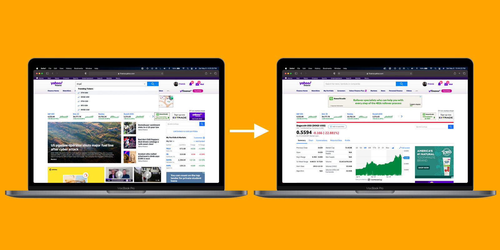
Search queries are made from the search bar, which has typehead autosuggestions for stock symbols. About 30% of the traffic that comes to the Quote Stock Page comes from the Search Box query. The result is the stock quote page associated with the search query. On the top of the page is an ad placement for a display banner ad. Click-throughs lead to the advertiser's site. Can we replace this display banner ad with a search-based ad format instead?
Designing search-based banners. The ultimate objective for any ad is for the user to click. There is usually a call to action (CTA) that provides an incentive for the user to expect value or utility. How can we make the CTA prominent to increase the likelihood of click-through?
Search Ad Format. Search ads are dynamically generated. The components of a search ad comprise an ad label, title, description, URL, and call to action. When designing the layout, we use visual hierarchy to direct the user's attention to the CTA.
Here are some basic design strategies that we like to explore:
Double ads placed side by side: As we have enough horizontal space to serve two ads, will the increased frequency result in the additional likelihood of a click-through?
Iconic vs. text CTA: Iconic buttons allow for more flexibility in laying out ad elements, but how does its performance compare to the clarity of a text-based button?
Banner height: Does an increase in banner height result in increased attention and user click-through?
Design Constraints. Our proposed search ads would replace ad banners served there, which have dimensions of 728x90px. We can use the entire width of the page but must consider the responsive design of the page. Although the existing height of the banner is 90px, we were allowed to have a height up to XXpx.
Native Design. As these ads are dynamically generated and rendered to the web page, we must adhere to the design language of Yahoo Finance. We ensure design consistency with type, color, and border treatments. There may be design elements with no endemic counterpart, in which case we make our best judgment.
We can only bucket-test five design variations for this round of testing because of limited engineering resources. The bucket test size is 5% for the control and 5% for each of the five variations.
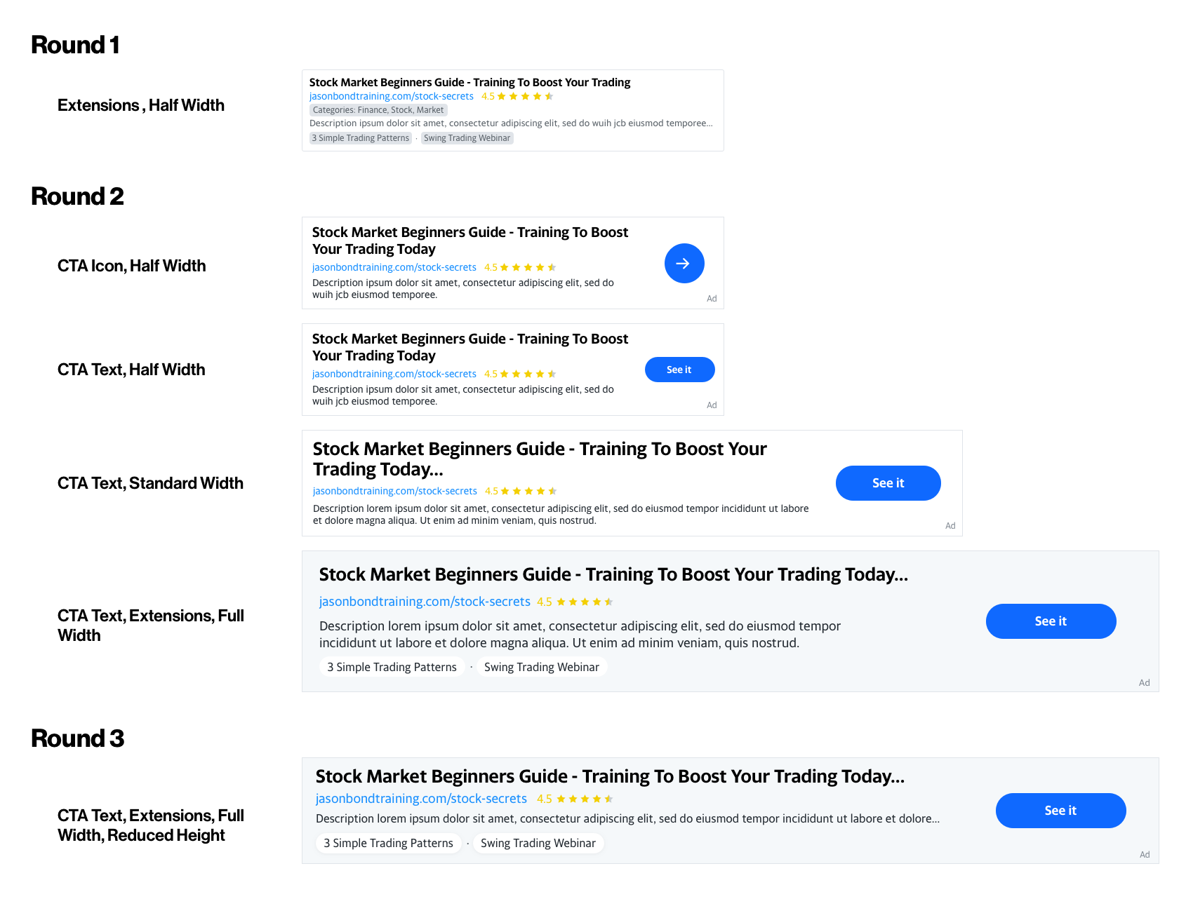
The Designs.
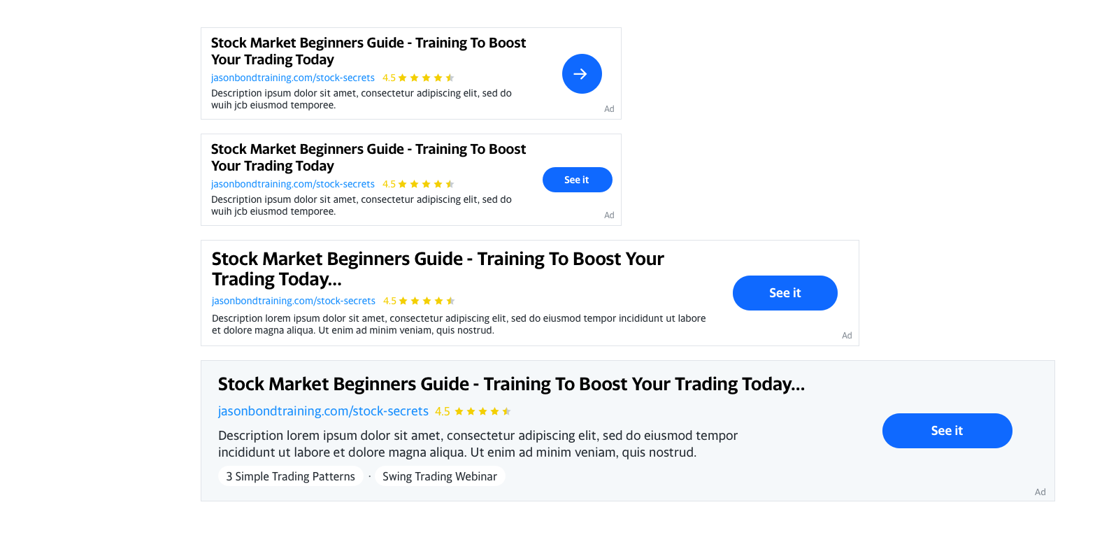
Design 1: Double ads separated with CTA as an arrow icon
Design 2: Same as Bucket 1 except abut ad containers
Design 3: Full-width container with CTA button with text
Design 4: Half-width with no CTA
Design 5: Full-width container, with a grey background and larger container height and callout extensions